Sunday, April 29, 2012

IS CONCEPTUAL ART JUST BAD PHILOSOPHY?

Eija-Liisa Ahtila: "ME/WE, OKAY, GRAY" (still from video, 1993)

When I was a student of philosophy, which ended up as one of my minor subjects, I was looking for answers about life's deeper questions but didn't find very many. My feeling at the time was that most philosophers sit in their armchair conjuring up contrived problems that have very little to do with what is really going on in the human psyche. The only modern philosopher that I could instantly relate to (and this was when I was 19 years old, without any previous formal education in these matters) was Nietsche. His philosophy is one that encompasses questions about spirituality and the human place in the grand scheme of things. It has an element of psychology to it. Years later, after my failed years in art college in France, I ended up studying the one subject that did provide me with the answers I was looking for, i.e. the psychology of comparative religion. I enjoyed every minute of it - until I finished my Master's degree which dealt with creativity and found that my health problems were making it increasingly difficult for me to read anything at all. 

I have to say, however, that I did nonetheless respect the serious philosopher who is that one deviant human being who is able to question the way we look at reality. Regardless whether these strange turns of logic and the challenge to our conditioned perception is of any deeper significance to the human race or not, it's still admirable. Some of these theories, for instance those dealing with our construction of language, are actually even relevant to human development.

I have often thought, however, that conceptual artists are very much like this - philosophers. They often throw ideas into the air for the audience to catch and look at, and it's very much about challenging our programmed brains. The problem is that the issues they like to dwell on very often end up being excuses for bad art, and in fact it's not very good philosophy either. These people would normally be incapable of writing a convincing, intellectual thesis on the subject of their challenging questions. And if they did, they wouldn't be artists but philosophers... I really feel that this is a great problem and I can't think of a single example of a truly successful artist who can do both with panache. Modern and contemporary art deals to a great extent with social commentary, and that's all fine and dandy. Trouble is, very little else goes down very well with the authorities of art, unless it's technically intriguing. What looks interesting and glitzy on the surface, with a promise of greater depths beneath, is very often just gimmicky art in the end. 

I get updates from the Saatchi Facebook page and it's amazing how often they promote art that is just "clever", i.e. it's a construct (often a face) of little bits of something, and it is technically very well advanced. This is usually not conceptual art, it's just art that looks good on the web. But what does it say? Not much, as far as I can see. On the other hand - and this is a bit of a paradox - there's the idea that individual artists are only eligible for grants and other funding if they provide a challenging view of reality and society in particular, and this is generally speaking the realm of performance art, installations and videos. These pieces don't render themselves well in photos nor are they easy to understand and relate to, so they have to be accompanied with a thousand words. It's the well articulated, but not necessarily very comprehensive, philosophical statements that convince the jury, as far as I can see. How often than not do we end up with art that is not of the heart but of the mind? How often is this just bad philosophy and not art at all?

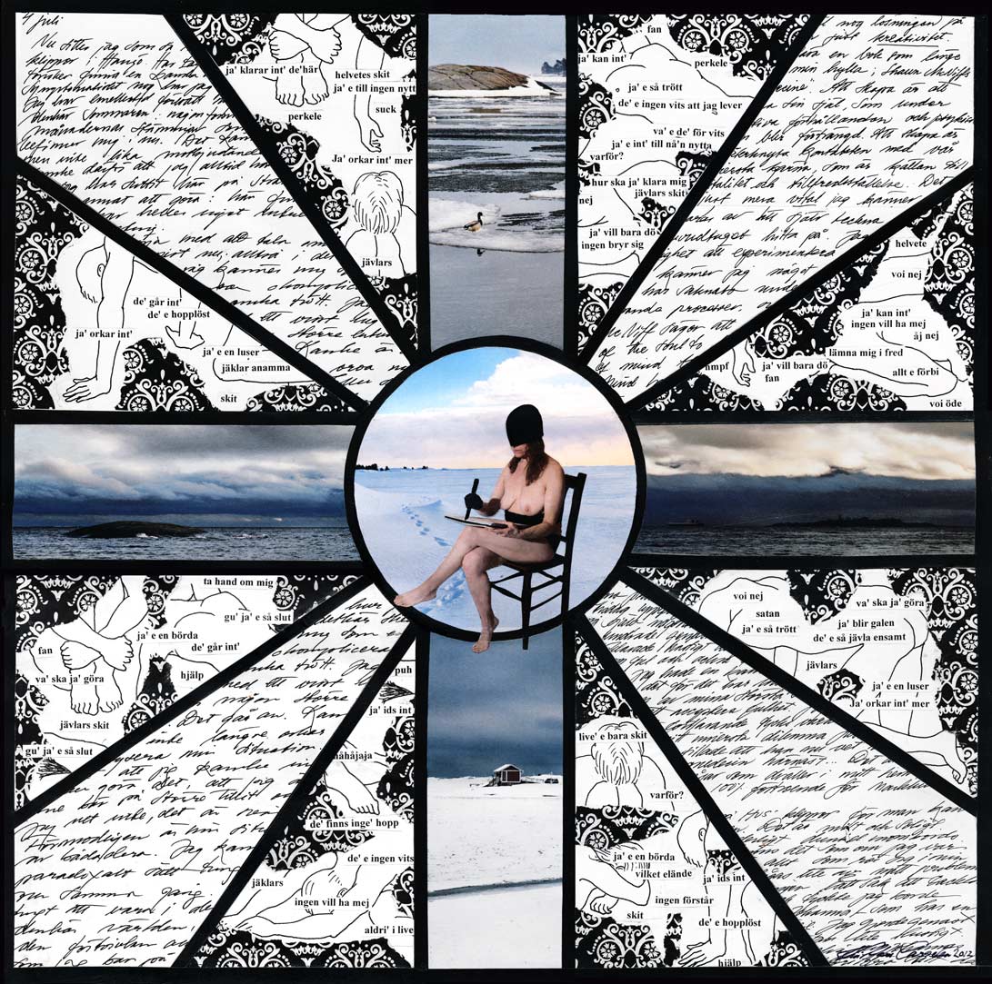
I'll give you an example. I was checking out a short article on a Finnish female artist who is considered one of the most innovative and is therefore internationally acclaimed. She is Eija-Liisa Ahtila, born in 1959. She also likes to have characters perform in ways that people wouldn't normally behave. In "Okay", a woman paces up and down the floor speaking loudly about violent relationships, and during the course of this performance her voice and thus her personality changes. What does it mean? Her work is supposed to be reminiscent of Finnish cult director Aki Kaurismäki's films - we just watched "The Man With No Name" and found the explicit contrivances about people who can only express themselves through their sentimental music very unconvincing. No - not all Scandinavians have Asperger's syndrome or mild autism like the heroines in many criminal stories of today. In another piece, some women go down in a lift to a place beneath the surface of water, they float around discussing atomic catastrophes; apparently this is meant to be some kind of parallel to their personal crises. I'm not sure I don't find this analogy a bit far fetched, and worse still - I don't really care. I'm not sure this is good psychology either, and so it leaves me indifferent. On this note, I have to admit I haven't seen any of this in real life and may have a better opinion if I did (but I doubt it). You may recognize the imagery of floating women and people in awkward, dreamlike situations from my review of Pia Borg's work.

On her website, Ahtila explains "ME/WE OKAY from 1993": "A short film with three fictional episodes and narration consisting of rhythmic monologues. The subject of these three humane dramas is the transformation of one´s identity. ME/WE is about balancing individual identity and about control. OKAY uses a single on-screen persona and various voices to consider the shifts, desires, and inhibitions of the ego within a sexual relationship. The subject of GRAY is the change in reality caused by a catastrophe, and the blurring of the boundary between ego and other."

You may like to check out JAR, an online magazine that attempts at a synergy between art and serious research. I signed up for it but couldn't figure out how to upload my stuff. I hope they have made it easier.

Modern/contemporary art is supposedly all about the fragmentation of the human being. It seems to me, that only those who admit to being existentially lost are considered serious artists. As far as I can see, it leaves us with a body of work that is mostly nonsensical and chaotic. I don't find it helpful to human evolution. I don't believe life has to be that way at all, and my own art does not express a fragmented world view. I'm not saying I am not interested in conceptual art... I will continue to be curious, and probably more so the older I get. I will continue to try and read what people mean even though I struggle to do so. However... We were watching a documentary about the Turner Prize and whether the art that has been awarded or nominated really is any good. I would say that sadly, most of it is just gimmicky. I mean come on, someone gets an award for turning the lights on and off in an exhibition space! This artist has nothing better to do than make art about his inability to make art - and that's quite a symptom of the "modern". And yet another is awarded for flattening silver plated objects and giving them a "new lease of life"... It's just sad.

What do you think? I would love some comments.

As I had just finished this article I came across this one, and here the author, Ben Lewis, states as he ponders the decadence of contemporary art (decadence has crossed my mind too) and especially that of Damien Hirst: "There is a pattern typical of these end-phase periods, when an artistic movement ossifies. At such times there is exaggeration and multiplication instead of development. A once new armoury of artistic concepts, processes, techniques and themes becomes an archive of formulae, quotations or paraphrasings, ultimately assuming the mode of self-parody./.../ I believe that this decline shares four aesthetic and ideological characteristics with the end-phases of previous grand styles: formulae for the creation of art; a narcissistic, self-reinforcing cult that elevates art and the artist over actual subjects and ideas; the return of sentiment; and the alibi of cynicism." Read more about "why modern art is so bad" here on www.prospectmagazine.co.uk! It's potent stuff. I don't agree that the use and repetition of certain style elements is all bad as they are signs of the times, but I do agree that style can easily become mannerism and a lack of originality.
Damien Hirst at Tate Modern, "For the love of God": This skull is covered with real diamonds. Perhaps this is meant to be
a cynical comment about modern day art collectors...  

"But what a small and conservative act of rebellion this glossiness is. Art has become small, superficial and self-indulgent in its emotional range: sentimental rather than truly intellectual or moving." I couldn't agree more, though my knowledge is quite limited due to years of ignoring the whole realm of conceptual art. I love the end: "To paraphrase Trotsky, let us turn to these artists, their billionaire patrons and toadying curators and say: 'You are pitiful, isolated individuals. You are bankrupts. Your role is played out. Go where you belong from now on—into the dustbin of art history!'”

Saturday, April 28, 2012

"THE NEW ANTIQUARIAN MOVEMENT"

This was an electrically wired lamp from the 80s in a boring shade of cream, and covered in dirt
when Martin saw it in a charity shop, saw the potential, and thought we should rescue it.
To be honest, it was a bit on the expensive side, £ 15,
 but I decided to make it into a surprise for his birthday.
I managed to get it home without him seeing it from his studio window,
cleaned it up and painted it. It turned out to be very difficult to keep it a secret!
Some mistakes happened as I had to hide the drying candelabra... but it turned out ok in the end.
New York Times has coined the term "The New Antiquarian Movement" in response the the increasing presence of a demand for artefacts that are reminiscent of times passed. The vintage style is here to stay for a while, as many people are tired of sterile, anonymous and mass produced modern buildings and objects human surround themselves with. This also goes for art, as the use of found imagery in the form of old engravings (copyright free, of course) inspires an increasing number of artists. My style has a name now! We shall see if this takes off or not. What is important within the context of art is to make a very clear distinction between vintage style collaging that has more to do with crafts than art, and more serious minded art that is technically advanced (whether done digitally or by hand) and carries meaning beyond the fluffy fairies with crowns on their heads that fill collaging groups on Flickr. This article  picks up on this and calls Kristjana S. Williams  "A British pioneer of what the New York Times has dubbed the 'new antiquarian movement'..." - I wouldn't go as far as to call her work pioneering since others, myself included, have been indulging in old engravings for over ten years, and sometimes even more. I don't even think her work is that fantastic. As I have said before, it's easy to get a glitzy result in Photoshop. Dan Hillier is another example of a digital collage artist who relies solely on old images and even made it to a Luis Vuitton show in the Louvre... lucky bastard!

Design Geekery; Kristjana S Williams
Kristjana S. Williams
Ironically, I am no longer relying solely on such found imagery but I'm sure I shan't abandon the style as these images are now widely available and free to use (apart from the cost of purchasing them in the first place, of course). I thought I should in this context show a few photos of Martin and myself as we dressed up for a Victorian/Edwardian themed party last week. Martin has received from me a host of accessories and clothes in a vintage style for birthdays and Christmases, and I think they suit him fantastically well. At the party, I especially admired the way men had dressed up, because it doesn't take that much to transform them from boring T-shirt dressed men in Nike sneakers to something much nicer to look at...


The jacket and coat Martin bought for our wedding,
and I got him the shirt and the Victorian style trousers for Christmas.
He bought a nice pocket watch with a Welsh dragon for the wedding.
He found the shoes in Finland.

The shirt and jacket are from Theatre'Hall in France (they have information in English but be amused,
it's all translated through the little reliable Google translator),
the Victorian style cotton trousers from FLB Westernwear,.
and the authentic braces are from Darcyclothing, who specialize in expensive
but very authentic and good quality garments and accessories.


"...we have been expecting you..."

My dress is a bargain from the Swedish shop Indiska some years ago
(there will be an online shop for the EU in the autumn), and it just happened to have a bit of an Edwardian cut

(sort of World War II, I'd say).
I was lucky to find net tights in 80 % cotton at New Look.
The pretty and fairly authentic shoes I've had for several years, they are Hush Puppy.
My jewellery is from Monsoon in the UK, bought about a year ago.
I felt that the earrings were quite authentic as they feature a fake pearl.
My hair is tied up with black fake flowers, the big one is from Bijou Brigitte where I've bought a lot of jewellery.


I bought this hat for only £ 12 as an impulse buy at H&M
a while ago but then thought it would do
as an Edwardian style hat -
perhaps a bit "Helena Bonham Carter" in the King's Speech
as someone pointed out!
Feather accessories for the hair are widely available right now so
I stuck one onto the hat.
I've had the coat for a few years, I got it from Indiska in Finland.
I had to wear these old strapped boots as it was cold out in the hills


Tuesday, April 17, 2012

MACHINE AESTHETICS, AUTOMATONS, TIME LAPSE...

Asa Butterfield in Hugo

Since the industrial revolution, artists have been fascinated with machines. This is especially true for the modernists, who seem to have enjoyed a sense of progress in the real world after the symbolist movement and their desire for the otherworldly had died away with the first world war. I think that what drives artists to resort to machine aesthetics today are different ideals altogether.

We saw Martin Scorceses' recent movie Hugo the other day but found it appallingly poor. It's wooden, slow and tedious, not to mention smacked with cliches. The only positive was to find out that it was about a real film maker Melies. I have an open mind when it comes to films that are mainly directed to the young (but was it?) however I'm getting increasingly frustrated with these films that are badly acted and so slow I doubt whether any kid would have the attention span to watch them. Another similar example is Airbender by Shyamalan who created a few fairly enticing movies in his time. 

Hugo features the rather typical steampunk romanticism that is still alive and well, with an automaton (a self-operating robot) as one of its main protagonists. In other words, intriguing machinery and an oldy worldy set (in this case a 1930s railway station)  is crucial to this kind of film.

I thought it thus rather interesting that the posh and often disliked Oriel Davies (gallery) in our neighbouring town Newtown featured short films with references to the dawn of movie making and oldy worldly machinery. Pia Borg won the competition in the previous open exhibition and was therefore offered a slot in the gallery. We had just checked in to see if something was on and didn't expect to sit down and watch films, so we both found it quite hard to stretch our attention span. I liked the oldy worldy, scratchy atmosphere of these approximately ten minute long videos, and they certainly confirm my suspicion that a big part of the population nourishes a nostalgia for times gone past that I also express in my collages. The new film The Artist, which I haven't seen, is a silent movie in the "old style". Yet I'm quite surprised that this vintage feel in Borg's work as well as the rather trite references to the passing of time and memory would go down that well with the director of this particular gallery. I suppose it's because the artist already has a nice track record from big galleries all over the world and comes out of The Royal College of Art... You can watch the winning film Palimpsest or excerpts from several films in the showreel here on Vimeo


Pia Borg: Stills from "The Crystal World", 2012
I don't know if hair floating in water is that original...


Palimpsest portrays a building and its occupants over a few centuries. The Automaton is a living person acting like an automaton, with a lot of imagery of old machines. The piece The Crystal World was created specifically for the exhibition and its main feature is part of a film from 1955 in which a woman gets murdered and chucked in a lake. The sequences were slowed down to create a dreamlike ambience. The bits from the original film are quite long and I found that a little bit odd from a point of view of copy right and originality. Other sequences that seemed original had been added to it like a moving collage. The persons in the two latter films are caught in weird and uncomfortable situations. I found it all quite likeable and technically very well executed, and it's obviously a treat to see art that has "made it" on the international art scene. Albeit I found the work somewhat lacking in originality and deeper message. Perhaps as a symbolist, I am particularly critical when it comes to a real message and just "time passing", "memory" and "uncomfortable situations" don't quite cut it for me. And I wonder how exactly you are supposed to enjoy this form of art - I always thought video installations in gallery rather difficult to deal with. In this case I was quite interested to see how the films were done since I am pondering whether I could venture to do a short autobiographical video based on a short symbolic story myself (well, nothing very fancy of course...).

On Oriel Davies' website you can read
"Through combining contrasting time periods, together with disparate cultural references and symbolism, Borg plays with aspects of recall and memory, creating ambiguity between the actual and the virtual." I wouldn't call this symbolism but surrealism, i.e. a mishmash of imagery such as hair floating in water, machine wheels rolling and meat coming out of a meat grinder without any obvious coherent interrelationship. I also feel that it's all been seen before - references to Le Chien Andalou come to mind. I'm sure you could think of the sequence as symbolizing a lack of vivaciousness as well as fluidity of thought and creativity that ails a lot of people of today but I think it's a bit of a long shot, especially as the machinery is old looking rather than new and sterile. Why all this imagery of machines? Well, I think it's easy. It looks good. It has the charm of loved and old, nicely worn out, pieces of antiques. I think generally speaking all this pretended symbolism is actually nice looking imagery taking precedence over deeper meaning. I do truly enjoy the atmosphere conjured up by this intriguing vintage looking imagery but that's as far as it goes.

Helena Blomqvist: Warm June, 2011
A similar approach can be found in the work of Helena Blomqvist, a Swedish photographer who creates dreamlike images using paintings and various props along with digital manipulation. Many of her images are fairytale-like, like stuff I've seen a lot of on Flickr (Fairytales and Fantasy are overall popular right now, be it low or high brow art). She's successful, but is it more about the craft than the contents? Is it about being clever regarding the set up? Some of her work is reasonably enticing. But again I'm missing some originality... rooftops, handmade houses and forests with various stiff figures can get a bit predictable. I prefer the older work that carries a hint of symbolism.

Helena Blomqvist: "The Silent Stream", 2011 (digitally manipulated photograph)


Sculptures of old bits of machines is also often seen in an age of "recycling aesthetics", for instance here in Jeremy Mayer's case.


Wayne Martin Belger creates fantastic pin hole cameras where each camera contains something that symbolizes the subject matter it was created for... check it out here!


Time lapse is all the rage, and was also part of the films at the Oriel Davies and especially one by Sean Vicary. Martin is very keen on getting a camera for this particular purpose, which to be fair doesn't cost much, and do some stuff with it for his projects. He's getting on with his work for the two upcoming exhibitions, some of which will be illustrations for a symbolic book that I read as a young girl and recommended to him.


Here is Martin's recent drawing, a jesting reference to Leonardo Da Vinci's flying machine! The design is all his own, created with the help of some software that renders one's visual ideas into a three dimensional form.

"Design for a Flying Machine to Escape the Bank Manager" : 72 x 52 cm :
Sepia ink, sanguine pencil, gouache & transfer print on tempera-washed
handmade Khadi paper : Copyright © 2012 by Martin Herbert

Wednesday, April 11, 2012

A JESTING REFERENCE TO DAMIEN HIRST... A NEW COLLAGE WITH PHOTOGRAPHS


Vivi-Mari Carpelan: "The Impossibility of Sleeplessness and Damien Hirst isn't exactly making it any better"
copyright 2012

I wanted to do something with my abstract photography for Project X, but I sat for an entire day wondering what the heck to do with it. Eventually, having looked through a lot of imagery that could be used and found a photo we took for something Martin wanted to do a couple of years ago, this is what came about. It then occurred to me that it was very obviously about insomnia. The sense of walking a thin line or trying to balance my existence like a tight rope dancer when my medication is failing is imminent. When I mentioned "the impossibility" to Martin, he said oh be careful, that's what Damien Hirst has called a lot of his stuff. I thought that's excellent, yet another thing to lose sleep over! I mean his success, his money - and I'm not feeling any enormous kinship with his art, haha. In case it's not clear yet, my reference is ironic, if even sarcastic.


"In a general sense, this piece is about the fear of a sudden fall into a state of despair and depression, and how difficult it is to remain balanced and “on top of things”. More specifically this piece is about insomnia, which in severe cases involves constant threats of medication not working any more, while one is being pumped up with habit forming medication in the first place. It's the fear of going insane with severe cognitive and physical impairment and with physical flare ups due to lack of sufficient good quality sleep... and never getting any really useful help from the medical establishment. On top of this there's the sleep schedule which always goes wrong, ie. something disturbs one's routines and tips the wagon so you end up sleeping/dozing/lying around well into the afternoon and always feeling the day goes by while you're simply useless. Managing a condition that happens when you're not looking, is like walking a tight rope, knowing you could fall any time. This piece is part of Project X. When I thought of the name including the word "impossibility" it became a reference to titles by Damien Hirst and his rather (in my mind) undeserved financial success."

All the photos are my own except for that of the bird.

Tuesday, April 10, 2012

EAT, DRINK AND BE MERRY FOR TOMORROW YOU WON'T DIE

Vivi-Mari Carpelan: "Be Merry for You Won't Die", 60x45cm copyright 2012 

It's time to publicize my recent piece in the series "Project X". I expect to use the cross in all images as the leading thread. Here, I ideas related to fibromyalgia developed. When your tender points are being tested and you're given a diagnosis, very often the doctor will tell you that you have very little to worry about since you won't die from it (the papers have "it won't kill you" spelled onto them). This is a stupid cliche that should be banned. What someone afflicted with this condition has in front of them is a life time of pain, fatigue, insomnia and a general insecurity about the future and how they will be able to cope with life's challenges. Initially, it was going to be a piece about the fallacy of excess positive thinking but this is what evolved instead. Your life, your future, is crossed out, you may try and take a positive stand (and of course you should try your best in this regard) but you are still going to remain in the realm of the unknown and stand on unstable ground, sometimes flattened by the weight of your ailment. 

Medicine, symbolized by serpents, is of no use, of course. One serpent is dead and the other is an imaginary sea creature, perhaps also a symbol of the unconscious and the realm of emotions. Flies and mosquitoes symbolize the irritation and being kept awake that is connected to insomnia. In the early days of the discovery of this condition and others such as ME, people were often told it was only in their head - and of course this happens still today, especially in regards to insomnia. 

The row of black windows indicate the people who don't look, don't see, and don't understand. Black lace could be a sign of mourning but also that the ugly truth is often covered up with a nicer idea of reality.

Saturday, April 7, 2012

HEALTHY STRAWBERRY CAKE FROM FINLAND


Wales 2011
Copyrighted photographs by Vivi-Mari Carpelan, 2011
I have promised to share the recipe for this delicious strawberry cake that we traditionally make for my birthday in the summer. Enjoy! It's in Swedish first, then Finnish, and lastly in English.
From the cook book "Art is Boiling, Artists' Recipes" that me and my mother were part of and it was published in Finland by Mini-Lilium (The Carl-Gustav Lilius foundation). Whether the recipe is mine or my mom's is hard to say, I would say it is probably mine because of the health aspect. You can if you wish substitute some or all of the wholemeal flour with some oat bran to keep it fibrous. You can add a decilitre of ground almond to make it extra delicious!


Copyrighted photograph, Vivi-Mari Carpelan 2010
Finland 2010


P.S. I managed to make memma, a peculiar Finnish Easter dish made from malt and rye flour - a kind of sweet porridge - hard work and may not look like much, but it's quite nice with cream! (Copyrighted photograph).


IS LESS REALLY MORE?

Vivi-Mari Carpelan: "Impairement by X", handmade collage, copyright 2012

Tadaa... this is my latest in the Project X series. It features text which is stream of consciousness and not edited at all. One is complaintive, the other attempts towards a more constructive attitude to life. They tell about some of my ordeals with insomnia in particular. I don't know whether I was influenced by Tracey Emin or whether I would made this choice anyway... I hope the rest is quite self-explanatory. The figures are old copy right free drawings of the nervous system, which is central to a lot of invisible illnesses, including my own.

I started to follow the showdown at Saatchi, in fact I submitted one of my abstract photographs for the competition for abstract art, however without the hopes I had when I submitted my collage late last year. I actually got to the second round of 300 participants out of 3333! 

Vivi-Mari Carpelan: "Nothing Was Quite the Way It Used to Be",
digital photograph copyright 2011
What strikes me is that the winning pieces are usually very simple. It seems to me that simple is still trendy, even though we've had a decade of that. Watching a show on Art Nouveau last night, I was thinking as I immersed in the beauty of the sensuous and life affirming yet stylized natural forms that that was the end of beauty. Don't get me wrong, I like simple too. But too much of it makes for too little. With Art Nouveau, you're constantly surprised, fascinated, excited, tantalized... it just doesn't get boring. Well, for the most part anyway, since too much of a good thing can be overwhelming too. 

I was flipping through The World of Interiors the other day and came across an article about Maria Joao Arnaud who went to India to learn traditional methods of printing fabric. So what did she create when she came home from the land of intricate designs and opulent colours? Squares, and a lot of them. To be fair there's other stuff as well but the designs are overall quite simple. Nothing particularly bad about it... just boring. When is this boredom going to end? I feel so deprived that I have to buy stuff that has a decorative formal language even when I can't really afford it - it is so rare these days though a growing number of people actually want it. Next time I will show an interesting chair I bought a while ago (it actually was a bargain).


As I was thinking of a new collage, a certain simplicity came to mind. I thought, why not, I can do that too. But I will never give up a desire for opulence and intriguing shapes. 

I have noticed, that people who get grants and other forms of support for their art are usually very articulate, i.e. they use their heads/minds very well. But what about their hearts? Check out the Julia Gomperts trust and the artists they have supported. It strikes me that most of them seem very young, articulate and conceptual. Their ideas are often complicated and deeply philosophical, but what about their art? I'm not sure all this headiness translates into art from the heart.

Wednesday, April 4, 2012

THE BA AIR CRAFTS PAINTED BY PASCAL ANSON ARE NOW READY TO GO


Martin took part in the contest for the decoration of twelve British Airway air crafts for the Olympics in London 2012, and was short listed among ten artists. Unfortunately his design (which was only a draft and to be elaborated on in conjunction with Tracey Emin) didn't make it in the end - you can read about here. Instead those in charge decided to go for this really bland and boring design which is supposed to represent a peace dove. The fact that the mentor Tracey Emin says her career was at stake says it all, really... Well what do YOU think? Is this great design and does it make you want to soar?

Apparently some disapproval of painted air crafts from Thatcher back in the olden days is still influencing decisions about these matters in Britain. I find that rather said. As a foreigner, it seems to me that the British often are so terrified of offending anyone and desperate to appear democratic that they are unable to launch any designs that are exciting and novel. Watch this video from the BBC (and note that the reporter seems a bit apprehensive about whether the design will grow on us...):


In progress...
The finished product... it's not bad but it's not great either. Will people even notice it?
Pascal Anson is comparing a dove with the stiff and mechanical looks of an air craft... a recipe for success??
Aww.... how sweet.


Tuesday, April 3, 2012

RELEASING TWO PIECES OF ART FOR "PROJECT X"


Vivi-Mari Carpelan: "Affected by X I (1/2)", copyright 2012
Vivi-Mari Carpelan: "Fragmented by X II (1/2)", copyright 2012

So... after a considerable amount of scanning, fixing flaws on the scans, and stitching all together, I am now ready to release these two recent collages into the world... Having said that, the process was made easier by the fact that I got a scanner for free from Freecycle that is about as good as the old one but is compatible with my reasonably new laptop! It's not a flat one like the really crappy one we tried a year ago. It needs to have space for some depth of field. The only thing is that my laptop is starting to have problems with big files. It's constantly freezing up and it's driving me up the wall... 


I wrote some about the first piece in a previous blog post. The the two pieces, which are two aspects of the affliction with X, feature photos of myself, photos I've taken of the Finnish winter by the Baltic Sea, some medical reports from Finland about my condition and pages from my diary. The pieces is about strength and weakness. The black garments represent the affected areas. The medallion "wallpaper" is as usual a symbol of "cover up", but the cover up is always as elegant as possible so as to counteract what really goes on beneath the surface (pain, fatigue, despair, hopelessness, discomfort, negative body image, etc).

In the first piece, "Affected by X", I'm talking about the dual, conflicting aspects of invisible illness.

Firstly, I think it's quite clear that the condition is not very obvious in these photographs though it's physically present and possible to detect. There is something not revealed as I am partially covered up in black fabric. Not only is it the affliction not obvious, but I also don't really want it to be obvious. Perhaps life would be easier in some ways if people could see what was wrong. On the other hand, most people instinctively strive towards blending in with other people, and not standing out as abnormal. The first conflict is thus the one where a person wishes acknowledgement that they are not up to living a normal life, yet also choose to hide it as much as possible for fear of becoming an outcast, "thrown on the dump". 

The second paradox is that while one is sometimes obliged to give in to one's weaknesses so that one can pace oneself and not overdo the chores of daily life, one often also develops stubbornness and strength of character. Personally, I have always fought the humiliating state of being a weak individual and so the two upper images portray my attitudes of defiance, dignity and fighting spirit. 

Thirdly, there are medical reports that portray the various aspects of illness in an objective, detached way, which is in obvious contrast to the subjective experience of it. These two portrayals may be equally true yet not truly compatible.

The fact is, many areas of the body are affected but not all of them, or only very little. The head and the eyes are definitely areas linked with cognitive difficulties, but the idea of not seeing is also symbolic of inability to perform or the inability of being able to predict what the next moment or next day has in store. Living with such a condition enhances a lack of basic security, and even more so as medicine is of very little help. 

The second piece, "Fragmented by X", is first and foremost about creativity. Creativity helps you find solutions in every day life but can also help analyse problems and set the straight, as well as offer an outlet for frustration. The pages from my diary radiate outwards like rays of a sun. They talk about how I was frequently feeling, where I would go to sit on the cliffs by the sea in order to be inspired, but also about solutions and ways of enhancing creativity in a more theoretical light. On the other hand, entropy seems to be lurking around every corner. The drawings portray men and women whose bodies express fatigue and despair. The phrases that surround them are various complaints that people express in their heads or out loud. The reason these are in Swedish is because I feel I can connect with these ways of expression in a way I can't in English. They express things such as "I'm of no use", "I'm a loser", "I can't go on", "It's hopeless", "I'm so fucking tired", "I wish I was dead", "no one can help me", "goddammit", etc. When I was thinking of various exclamations and general complaints I actually started to feel really bogged down. This is how powerful negative words can be. So in this piece there is the positive strife for a more constructive and creative way of life, and the eternal struggle not to fall prey to hopelessness and despair.

The pieces, which are structured around the X, talk about my background through photos of the Finnish winter; the solitude of the shoreline, the rather harsh climate and the generally speaking rather unemotional environment. Still, it's also an environment that fosters what we call "sisu", i.e. a form of power of will and tenacity that is often considered peculiar to the Finnish. I feel that I can get away from it all in Finnish nature in a way that is not possible in the UK. The other aspect of my identity is the fact that the words are in Swedish. In my next piece, there will be words in English because that particular aspect of my life is one I tend to express in English. Underneath it all, there is a wish to consolidate the various aspects of my identity as I tend to feel rootless and insecure.

They are fairly large pieces and it was as usual very hard for me to focus and get it right. I had to do a lot on the computer, which is tiring, and then cut things very neatly, which is nowadays very difficult as one has to be able to focus well and have very steady hands. I know the handmade aspect shows, but crafting my collages by hand is one of those things that I don't want to give up because I feel that it adds emotional value to them.

POST SCRIPTUM: After some contemplation I have arrived at this summary about the two pieces:

The two pieces form a diptych about the fight against fragmentation of the body and mind. It's is part of a larger project called "Project X", an attempt to make invisible illness visible. X stands for many things, among others "crossing out" and "marking a spot" - here it often denotes an ailment unknown to the viewer. The two images feature photos of myself posing with black garments covering the afflicted areas and unable to see how my life might unfold due to the condition. There are photos I've taken of the Finnish winter by the Baltic Sea (the harsh climate is partly a source of the strength of will typical of people of the North - there is a paradox in that snow symbolizes emotional coldness but can also have a comforting quality), some coldly objective medical reports from Finland about my condition that contrast with my subjective experience, and pages from my diary. The "wallpaper" is a symbol typical in my art, as it represents "cover up".

The first image is about external strength and weakness, the second piece about internal ditto and more specifically about creativity that radiates from the centre. The grids represent the attempt to hold everything together in the face of the pertinent entropy and fragmentation that threatens the afflicted person on a daily basis.  The pieces also speak of a complicated kind of eternal cultural identity crisis and problem with belonging - this is represented by the presence of text in Finnish and Swedish, and the shape of the pieces are reminiscent of the Finnish and the British flags. For instance phrases that surround the drawn characters burdened with fatigue are various complaints that people express in their heads or out loud. They are in my mother tongue Swedish because I feel I can connect with these ways of expression in a way I cannot in English. They express feelings such as "I'm a loser", "I can't go on", "It's hopeless", "I'm so fucking tired", "I wish I was dead", etc. As I was thinking of various exclamations and general complaints I actually started to feel really bogged down - such is the power of negative thought.

'There is something not revealed as I am partially covered up in black fabric. Not only is it the affliction not obvious, but I also don't really want it to be obvious.'

Ultimately, I am on a journey of discovery - is it always possible to triumph over adversity? The challenges of my life have been many, and often I was faced by problems that seemed impossible to disentangle. Very often I did it nonetheless. I want to see if there is a way in which disability not only teaches us about humility, compassion and the value of diversity, but also has a place in a human life that would be lacking in intrinsic value if it was too perfect.