
I meant to write a little bit about a show I saw recently, because for once I had a positive response. There was great deal of affinity with my own ideas. However, it seems that the things that make me angry and upset are more likely to end up on my blog, haha... time is always of the essence, I'm really struggling to manage my day.
To be honest I don't feel like any great analyses since about a month has passed, but will say a few words nonetheless.
 |
| William Kentridge: You are Lying, 2010 |
As far as I can see, there is no particular or at least very obvious reason why William Kentridge, a South African printmaker and animator, would be famous enough to end up at the Tate and be part of their book collection of contemporary artists. There is nothing terribly novel about his work. However, it may be that it's a timeless quality that speaks to me. While I'm a bit tired of figures, which is such an obvious subject matter - and his are sometimes a bit derivative of Picasso and other artist at the turn of the last century - his figures have a roughness and weight that speak to me. They are solid and corporeal, and imperfect. They aren't always well drawn but it sort of works in pointing to the humanness of the figures. It's the kind of imperfection I've been touting a lot recently! It's a charming relief and contrast to the sleek and over-sanitised work you see a lot (especially when it comes to figures).
 |
| Socialist propaganda poster. "Do you want to - overcome the flu? overcome hunger? eat? drink?" Well, the cure for all that is exemplary work with the party, of course. |
 |
| William Kentridge: Nose 22 An explicit reference to socialism using cyrillic letters - Kentridge illustrated a Russian opera called "The Nose" |
There is a kind of socialist aesthetics - a lot of black, white and red with a great deal of yellowed pages from old books, that gives it all a rather dark air yet is also graphically effective. I'm drawn to the murkiness and graphic quality of socialist imagery of the Soviet era, the red of socialism making no excuses for itself as it pops out of the plain background (presumably cheap to print). Kentridge made images based on Russian operas and has clearly been intrigued by cyrillic lettering too. This is teamed with his love of texture. It reminded me that I've always wanted to pursue this kind of aesthetics but got side tracked. Monochrome work spoke to me already as a child when I read Tove Jansson's Moomin books.

You can see tendencies in this work by me. In fact there are elements of vintage style collaging in Kentridge's work, though printed, many look like collages using old book pages and text written or printed here and there - this seemed mostly the case in work from the '90s.
I was quite transfixed by the series "Summer Graffiti" shown above, especially the piece at the top. It's a shame that you can't see the subtle red lines of the note book paper. That little red really adds to the images. I was interested in the way he layers the elements so they defy space. In other words, it's flat and dimensional at the same time, and this creates visual interest. I found myself looking at this for a long time. I also like the strong black shape of the blackboards, which adds yet more weight to the whole thing but also provides focal point and a solid contrast to all the thin lines present in the work. The whimsical drawings on them as well as the erotic theme are quite amusing They are images that entertain in a gentle sort of way. Kentridge is clearly a sensual and emotional guy who is comfortable with his sexuality.


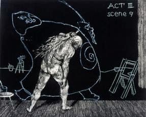
Unsurprisingly, Kentridge started out as a pantomime artist. The concept of the world as a theatre and the idea of carnival time is strongly present in his work. There's a tendency towards the surreal. The theatrical aspect of the work also resonate with my own work a great deal. I do nonetheless think this tendency of his has become a tad mannerist that sometimes lacks depth.

I feel that Kentridge is definitely at his best when layering a great deal of texture and lines, these images are very expressive and convey an atmosphere of strangeness. In a couple of large prints his figures were strange and ominous, just barely recognisable as human figures, and that also worked for me. I guess I'm repeating myself but many of his more complex images beg me to look at them over and over again, and that is a rare experience in today's world. Of course the show I saw was very limited so if I have some money one day I will definitely purchase a book of his work. He's impressively prolific and also makes animated films.
 |
| William Kentridge: Ubu Tells the Truth |
Unsurprisingly, Kentridge started out as a pantomime artist. The concept of the world as a theatre and the idea of carnival time is strongly present in his work. There's a tendency towards the surreal. The theatrical aspect of the work also resonate with my own work a great deal. I do nonetheless think this tendency of his has become a tad mannerist that sometimes lacks depth.
I feel that Kentridge is definitely at his best when layering a great deal of texture and lines, these images are very expressive and convey an atmosphere of strangeness. In a couple of large prints his figures were strange and ominous, just barely recognisable as human figures, and that also worked for me. I guess I'm repeating myself but many of his more complex images beg me to look at them over and over again, and that is a rare experience in today's world. Of course the show I saw was very limited so if I have some money one day I will definitely purchase a book of his work. He's impressively prolific and also makes animated films.
My own work:
 |
| Vivi-Mari Carpelan 1993 (drawing) |
 |
| Vivi-Mari Carpelan 1997 (drawing) |
 |
| Vivi-Mari Carpelan 2013 (collage) |
 |
| Vivi-Mari Carpelan 2008 (collage) |


 |
| Vivi-Mari Carpelan 2012 (abstract photographs) |
